Chip

Chips let travellers enter information, filter options, make choices, and ultimately take action.

Chip

Maven Central Class reference Source code

All

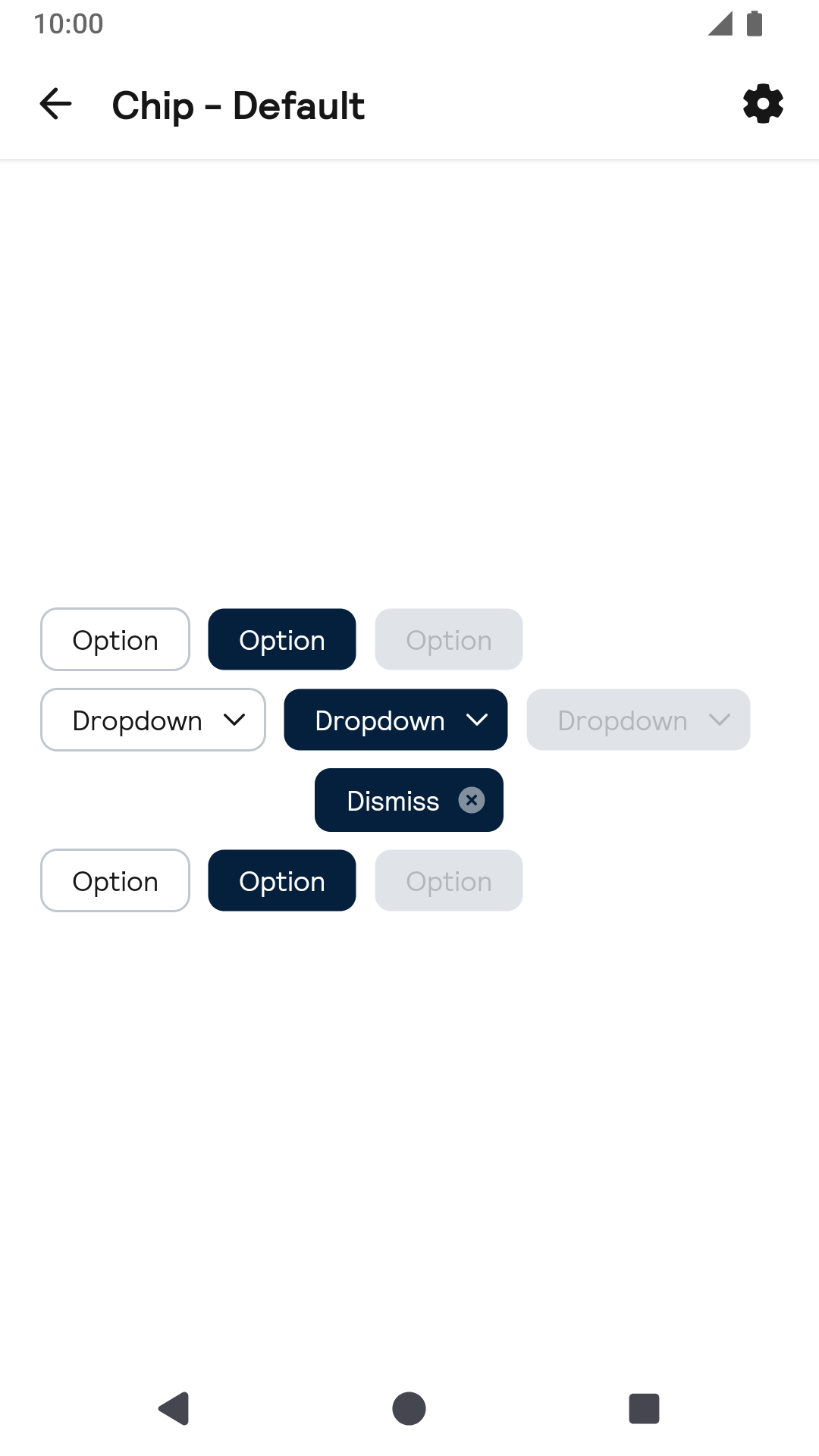
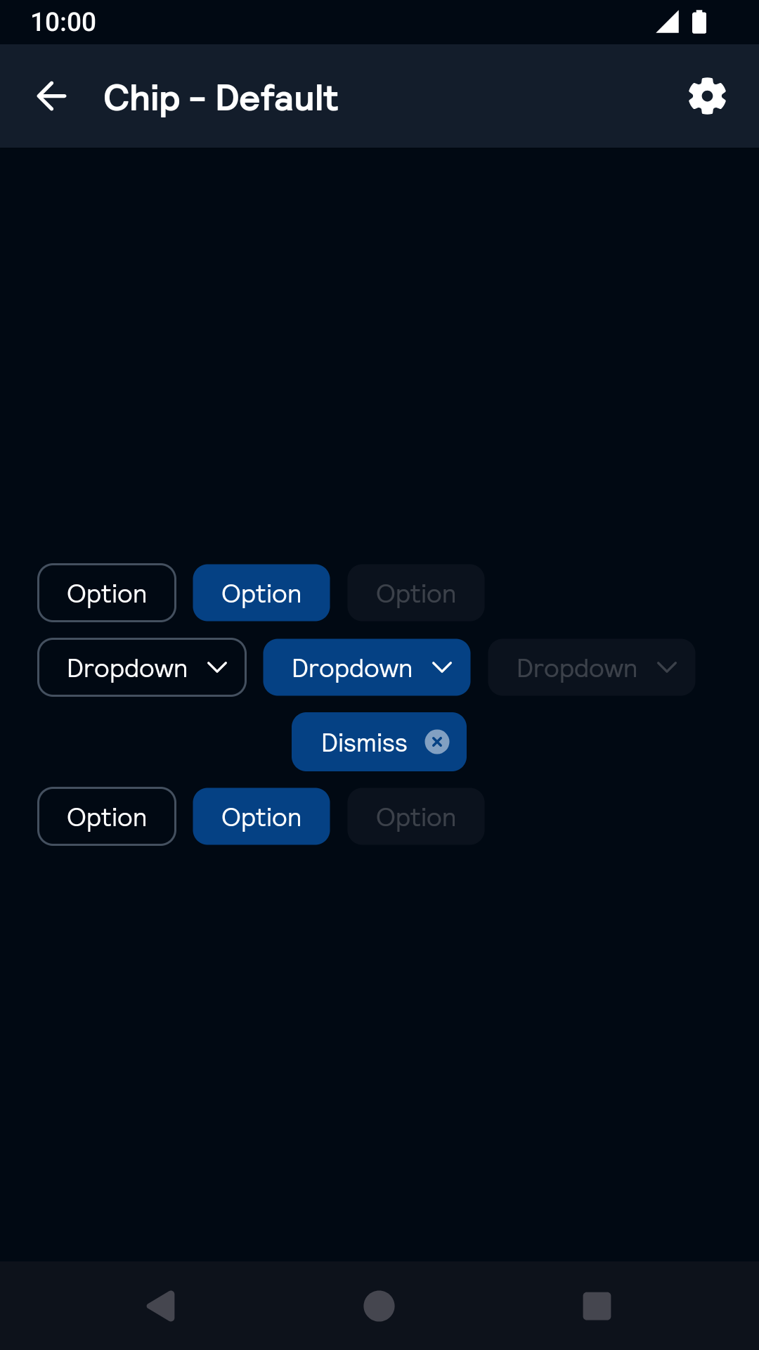
Day Night
Chip component Chip component - dark mode

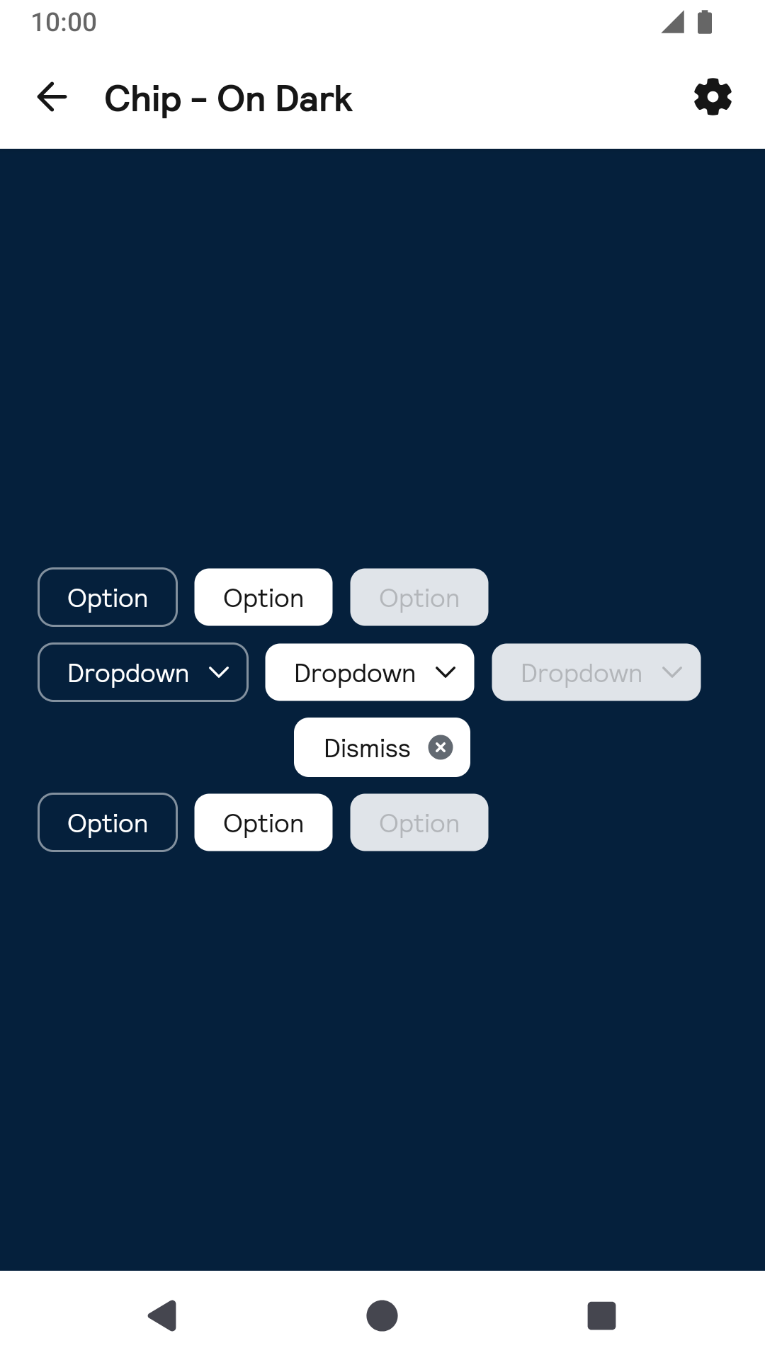
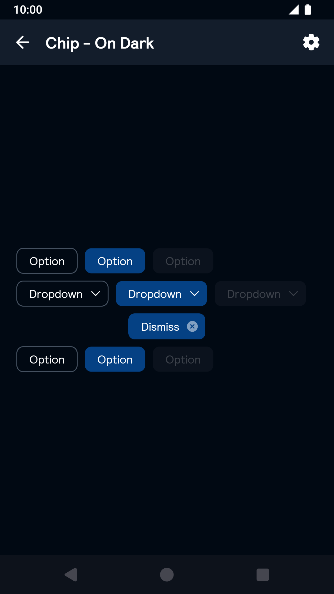
On dark

Day Night
On dark Chip component On dark Chip component - dark mode

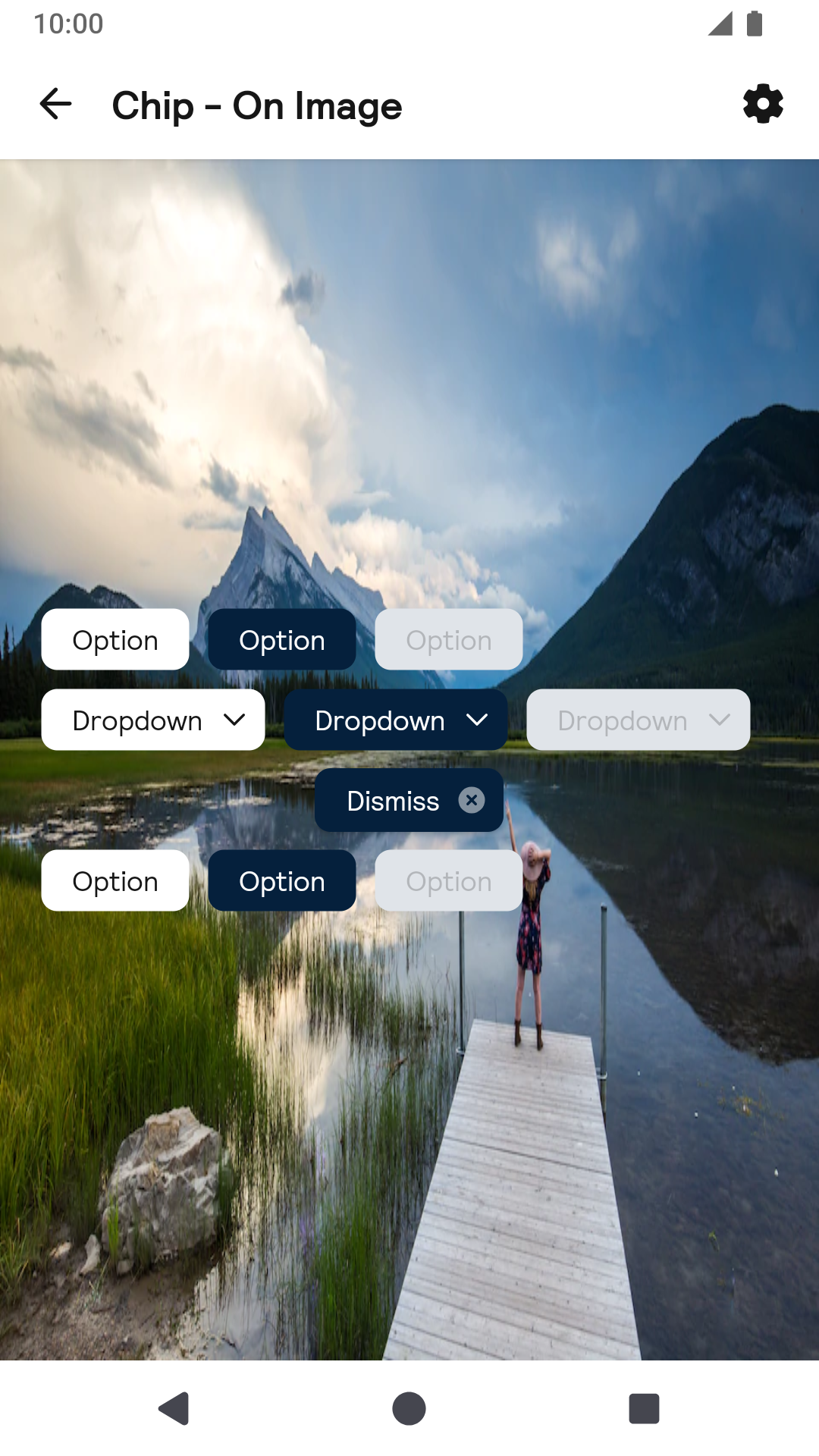
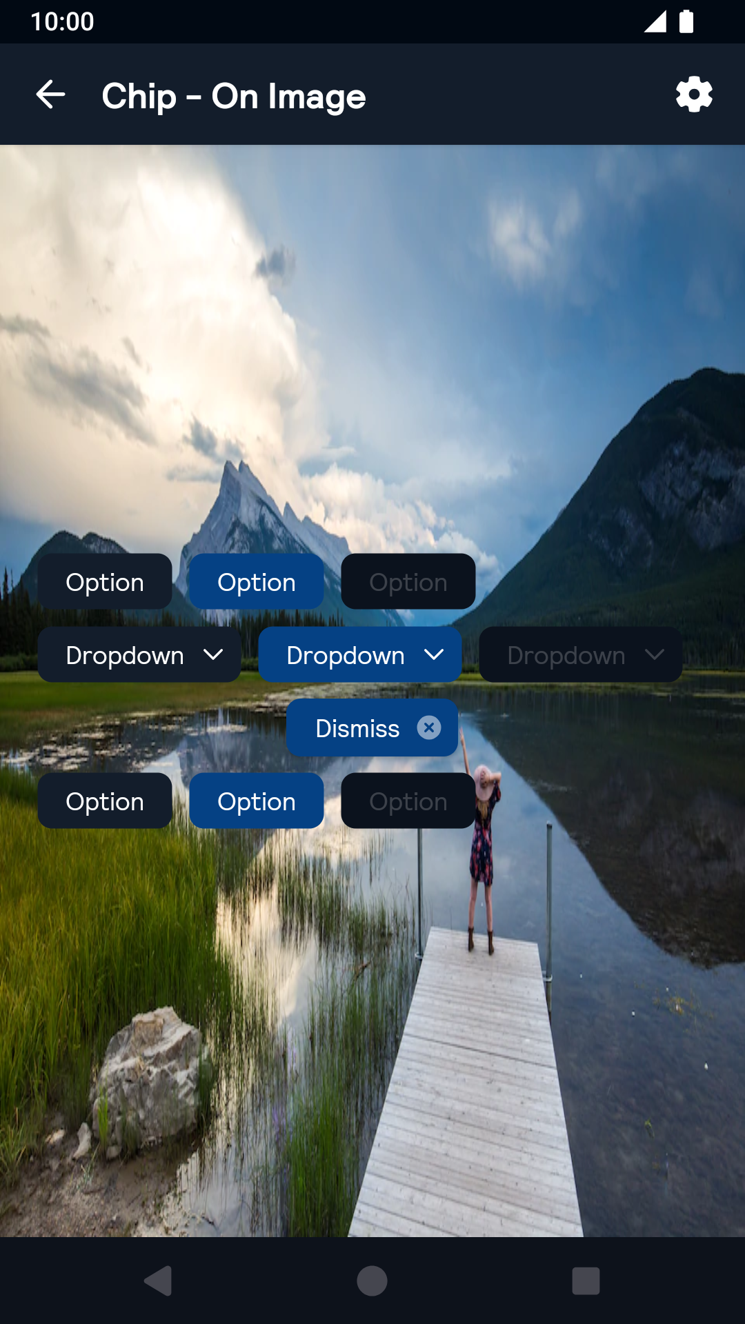
On Image

Day Night
On Image Chip component On Image Chip component - dark mode

Installation

Backpack Android is available through Maven Central. Check the main Readme for a complete installation guide.

Usage

The Chip component can be used in both XML and Kotlin/Java

Example of a chip in XML

<net.skyscanner.backpack.chip.BpkChip
  android:layout_width="wrap_content"
  android:layout_height="wrap_content"
  android:layout_margin="@dimen/bpkSpacingSm"
  android:text="Message"
  android:enabled="true"
  app:selected="true"
  app:chipIcon="@drawable/bpk_close"
  app:chipStyle="onDark"
  app:chipType="dropdown" />

Example of a chip in Kotlin

import net.skyscanner.backpack.chip.BpkChip

BpkChip(context).apply {
  text = "Message"
  isSelected = true
  enabled = true
  chipBackgroundColor = context.getColor(R.color.bpkSkyGrayTint07)
  chipTextColor = context.getColor(R.color.bpkTextPrimary)
  chipSelectedBackgroundColor = context.getColor(R.color.bpkSkyBlue)
  disabledBackgroundColor = context.getColor(R.color.bpkSkyGrayTint07)
  chipIcon = AppCompatResources.getDrawable(context, R.drawable.bpk_account)
  style = BpkChip.Style.OnDark
  type = BpkChip.Type.Dropdown
}

Toggling the chip's state

By default the chip does not add any click listeners, so clicking it will not toggle its state. To do so add a click listener:

chip.setOnClickListener { chip.toggle() }

Theme Props

  • chipSelectedBackgroundColor
  • chipBackgroundColor
  • chipDisabledBackgroundColor
  • chipTextColor

Styles can be changed globally through bpkChipStyle. Check theming for more information.